
 This album cover mainly consists of imagery based around the design of fruit stickers.
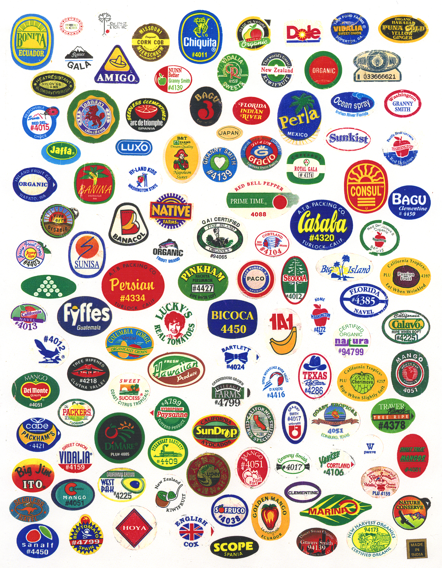
- Front features the artist's name at the top in bold capital letters to draw attention to it first to appeal to fans of the band.
- Printed to look like it's on paper to make it seem of poorer quality for an indie look.
- Font is slightly 'destroyed' for the same effect.
- Main image is designed to be like a fruit sticker (see above) to remind audience of the past when these used to be placed on more fruit.
- Imagery of fruit stickers reflects the band's British identity.
- The back is still printed to look like paper and is seamless to the front because the spine has a similar design.
- The back is covered with fruit sticker inspired designs for each track on album. Each sticker has the track name, "Kaiser Chiefs" and the track number all integrated subtly.
- Designs are also printed to original size of stickers.
- Copyright details and bar code are located to the side so that audiences don't notice it immediately.
- Signed with British labels to anchor that they are a British band.
- Song titles mostly appeal to a male audience.
- Inside is covered with fruit sticker designs for reasons previously mentioned.